Topic 5 Posts

Apple

Off-piste with Vision Pro

Played with Vision Pro off-script for ½ hr. I told the saleswoman I’d had the scripted demo already. She was like, have at it, I’ll watch and learn from you :) Like a car dealer who tosses you the keys and says come back in an hour.

This was a much better demo. Tried every app and environment. Size 21W light seal gave me clearer video and a much wider FOV. Fit is critical.

Pre-launch, Applers claimed they were using Vision Pro hours per day, which sounded like BS. Now feels plausible.

Watched “Masters of the Air” in the cinema environment, really felt like being in a theater down to the ribbed ceiling.

The dinosaur demo really does invoke synesthesia when a butterfly lands on finger—you feel a light touch or static electricity.

If you pat the big dino on the snoot, it backs away like a golden retriever. Your hands on its snout break immersion, the goggles struggle to mask them.

Pulled apps toward me and directly scrolled by touch. Same with the VR keyboard, just poked and typed.

Enjoyed Mt. Hood at night, Yosemite, the Moon, the Hawaii volcano, White Sands.

Typed in Notes, drew in the air with Freeform, played with Mail and Messages.

Friend who bought it says the hand tracking is too aggressive, lots of spurious taps. Like trackpads had to improve palm rejection back in the day.

The hand tracking and VR keyboard will likely eventually be good enough, like iPhone’s soft keyboard did vs. BlackBerry. Big simplification not to have external beacons / sensors or controllers.

Apple tends to be stingy with hardware access (no camera for you) and takes most of the dollars in the market, vs. Wintel. Nevertheless, very interesting platform for app dev.
Vision Pro demo

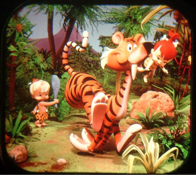
Remember how fun the 3D ViewMaster toy was? Vision Pro feels like a dynamic ViewMaster: realtime-rendered 3D apps, movies, and your own pics and video, minus the brilliant colors.

Cool

  • Scroll and two-handed zoom feel very sci-fi, “Minority Report” with micro screens rather than holo.
  • Custom gestures would be even more fun—thumb down to close apps, Force choke to terminate
  • The best entertainment experience, because it’s 360° 3D. Immersive sports, angles you can’t get with tickets at any price
  • Wrap-around 8K movies: see a diver wrestling a chonky shark, the striated mud on a rhino‘s hide, puddles on the side of a high cliff
  • More visceral, 3D family videos and pics
  • Step inside your panoramic photos
  • Window shadows rendered in real time as you move them around

Less cool

  • Text wasn’t sharp off center. Not sure if because of prescription lenses or laggy foveated rendering. But wouldn’t use it for work.
  • Current apps only mildly 3D
  • 3D animated movie: seen it before
  • Misses a few tap gestured

Input

Input speed isn’t great. Eye tracking + separate controller would be fast, e.g. for games like “Missile Command.”

By speed: keyboard shortcut > eye + controller > eye + gesture > trackpad.

Ergonomics

Keeping your hands in your lap is easiest, but you can also tap or push-scroll apps within reach.

Humanist

Friendly, humanist Apple: first thing you see after setup is a thick, white cursive “hello,” which went from Mac to iPhone to Vision Pro. Lots of neutral dark gray and white and classy frosted glass, less Wii-verse.

The more intimate computing gets, the more you need a human-centric co for both privacy and to design the things touching your body.

I don’t trust MetaZuck at all. Google has the wrong people to do it, back end devs. Neuralink’s Musk is a sociopath.

Fit

Apple brute-forces human biodiversity with tens of light seal sizes, like its numerous Watch band sizes.

Privacy

Apple sales casts your view to their iPad mini so they can help you out with the UI. It’s awkward when they can see exactly what you’re focusing on in movies :)

Parts

Vision Pro’s digital crown and side button came from Watch via AirPods Max. Like Tesla reusing Model 3 door handles on the Semi.

Vision Pro: what was I made for?

Vision Pro: You can’t multitask with eyes and both hands, have to look at each control serially and tap with one hand. More like a telegraph than a keyboard.

Eye tracking works better for fighter pilots because they also have physical controls like weapons buttons, eyes are just used to pick targets.

MacBook trackpad, keyboard can control native Vision Pro windows, can actually get work done until you get tired of it on your face.

The virtual keyboard only supports pecking with the index fingers.

The aesthetic is much cleaner than geeky Meta. Less Wii, more Bauhaus. Less social, more productive.

You can practice your presentation on a virtual stage at the actual venue, with the slides on a big screen behind you.

Panoramic photos are curved around you, like a peek into real world.

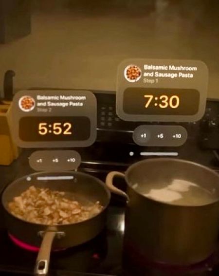
AR pomodoro timer:

Personas show your hands as you gesture. The angle of your head match Lee who you’re looking at.

Spatial audio matches the virtual environment you pick, and when you move a person’s window to the side or back, the sound matches.

Showing 5 screens at once in a semicircle around you isn’t useful for me, though it would be for air traffic control, stock traders, etc.

The simulated eyes are lenticular so they look like they’re actually on your face, not bugging out in the screen. But that sacrifices brightness and clarity.

MKBHD: the simulated eyes are not as visible if you have dark skin.

Personas explain Apple’s fixation on Memojis, they were working toward these 3D sims.

Optic ID is probably iris biometrics.

Lots of little niceties. Setting pupil distance is motorized, not manual. People ghost into view when they’re looking at you.

Apple seems to have solved anchoring virtual objects in physical space, rock-steady according to reviews.

Neargoggling

Before trying it— Vision Pro seems much improved over earlier VR like Vive, but feels like niche use cases rather than daily productivity.

Focused on productivity over gaming, with iOS apps available. I don’t buy this yet. For comparison, AirPods Max are enough friction to don / doff that I sometimes just use the crappy built-in speaker on the Mac mini—let alone something significantly heavier which covers my eyes too.

I’m skeptical people will strap this to their face for half a day. I could see using this for specific, relatively short purposes.

Eye tracking is faster than a trackpad, famously used in fighter jets.

Gesture tracking seems like it would be much less reliable than tapping a trackpad, but is more natural than controllers.

Higher res gives you much nicer video pass-through, which makes it more convenient to leave the headset on, and less likely to have people sneak up on you.

Nicer materials, Apple-style, at the cost of excess weight, again Apple-style.

3D uses:

Navigation
Piloting drones
Design
Assembly
Repair
Video

Travel: portable IMAX, nicer experience. But not more portable than a laptop and AirPods.

Warby / Zenni knocked out most of the optometrist racket, except for the eye exam cartel. Cut my cost for reasonably stylish glasses by 90%.

The Vision Pro prescription lenses cost more than my entire pair of glasses, including lenses and frame.

Screens vs. sensors

Phones and watches face in, the Humane chest pin faces out. Mainly screens vs. mainly sensors. A body pin is more convenient for analyzing the real world.

Convenience wins for frequent use. E.g. wristwatch > phone for checking time. Is analyzing the world frequent and useful enough yet that you’d actually wear a lapel pin all day?

It’s the same question as AR glasses, but those combine both in- and out-facing, both world sensors and high-bandwidth screen.

Because the pin faces out, it has no screen, just a low-bandwidth projector. If it were a sidekick for your phone, you’d have the best of both.

But then you’d gate your sales on users buying an even more expensive device. And you’d be a sharecropper on someone else’s platform, someone who’ll inevitably clone and wipe you out if you take off.

Might make more sense as an  Pin than a startup.